A professionally printed brochure is a powerful marketing tool, but its impact is instantly undermined by uneven color. Streaks, splotches, and visible variations across a solid background appear unprofessional and can distort your brand’s message. Fortunately, this common issue is often solvable by addressing a few key areas in the pre-press and printing process.
The first and most critical step is design and file preparation. Often, the root of print inconsistency lies in the digital file. Ensure that all images are high-resolution (typically 300 PPI) and that large solid color fields are created correctly. Avoid using RGB color mode, which is for screens, and build all graphics in CMYK, the color space of printing presses. For extensive solid backgrounds, instead of using a single flat color in a program like Photoshop, create them in a vector-based application like Adobe Illustrator. This ensures the color is defined uniformly across the entire area. Additionally, apply an “Overprint Fill” for black backgrounds to prevent unsightly white slivers.
On the press side, the problem often stems from an imbalance between ink and water. Offset printing relies on a precise balance where ink adheres to the image area and water (dampening solution) repels it from non-image areas. An incorrect water setting can cause the ink to emulsify, leading to a mottled, speckled appearance in what should be a smooth tint. A press operator must carefully recalibrate this balance to restore consistency.
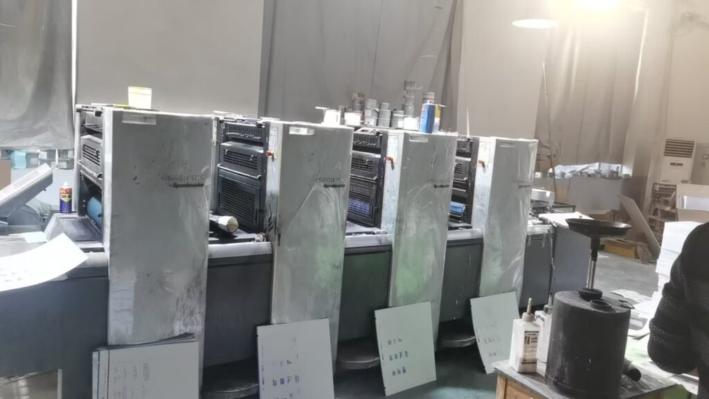
Furthermore, the physical condition of the printing press is paramount. Worn or damaged rollers are a primary culprit for streaking. These rollers are responsible for evenly distributing a thin film of ink to the printing plate. If they are glazed, pitted, or uneven, they will transfer the ink inconsistently, creating repeating lines or patterns down the sheet. Regular maintenance and inspection of the roller train are essential to prevent this mechanical cause of color variation.
Finally, the paper choice itself can contribute to the problem. Highly textured or uncoated paper absorbs ink unevenly, which can be a design feature for a rustic look but a defect when a smooth, uniform field is expected. For projects requiring flawless, vibrant solids, specify a high-quality coated paper. The smooth, clay-based surface of coated stock allows ink to sit more uniformly on the surface, resulting in a consistent and sharp finish.
By combining meticulous digital file preparation with a well-maintained press and the correct paper selection, you can eliminate the frustration of uneven color. A thorough checklist and clear communication with your print provider will ensure your brochures present a perfectly uniform and professional image every time.